Urban Exploration Inc's Web Re-Design
A Responsive Wordpress Website
-
Wireframes
-
Website Design
-
Front End Development
-
Wordpress
Patricia Olmstead owns an ubran landscape design company who's web presence was in need of upgrading and modernizing.
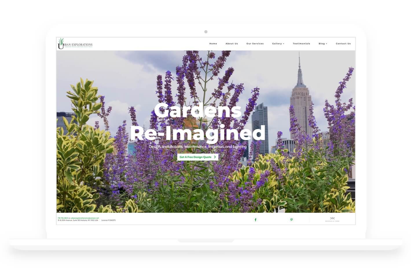
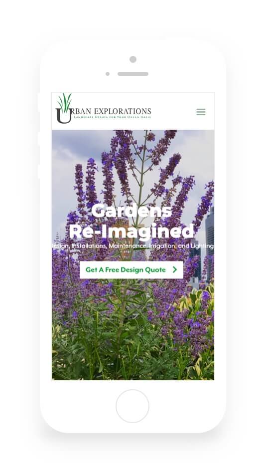
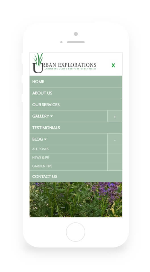
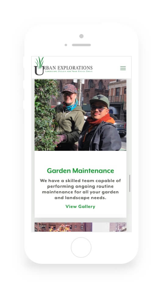
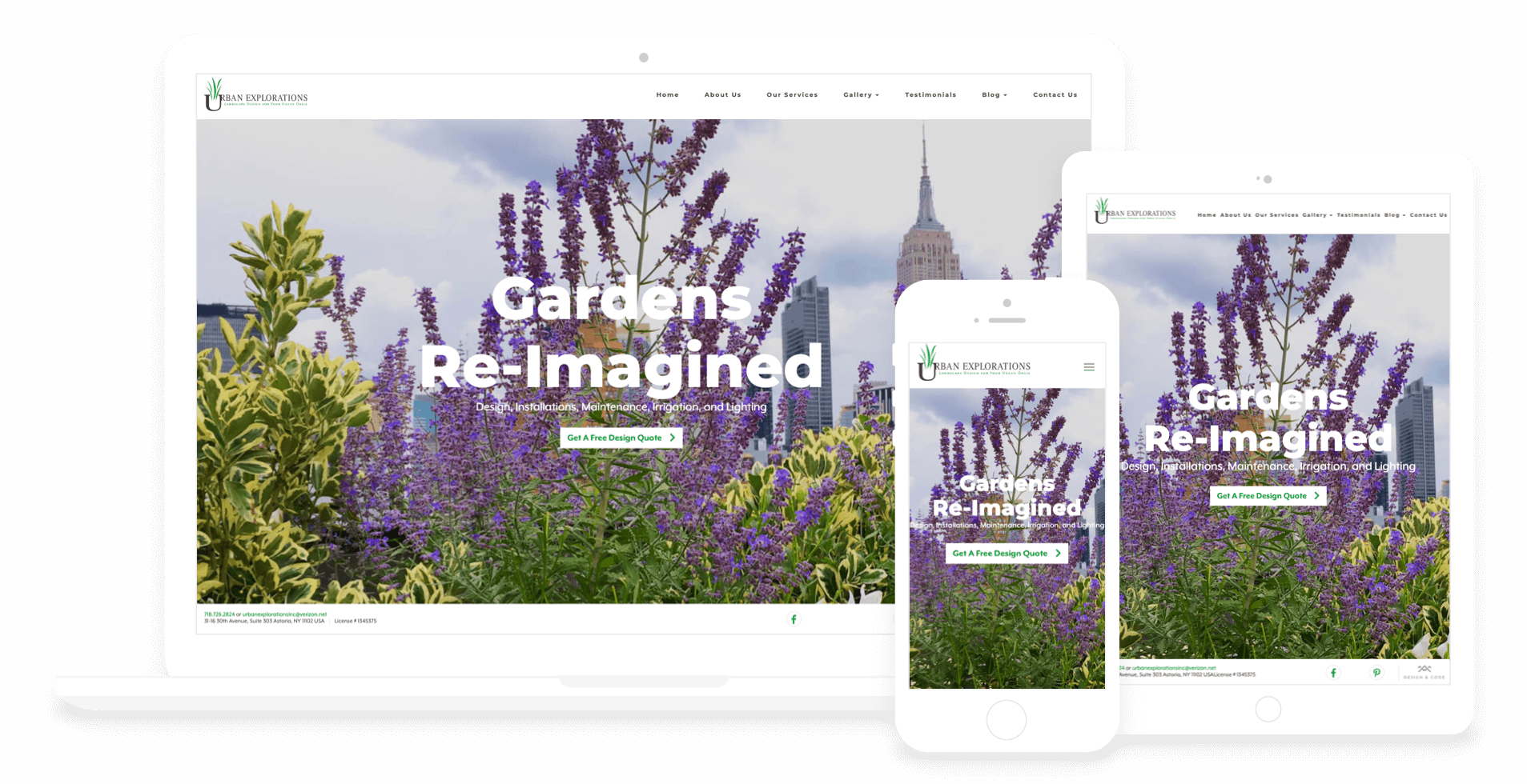
I was asked to redesign and build a new site for Urban explorations. The existing website was beyond dated, the photography was pixelated and very low resolution, and there were 3 navigation systems. The site also had a static frame size with scrolling panes inside of those frames. My immediate goals for the new site were to make it mobile ready, focus more on relevant content, beautiful large scale landscape photography, better accessiblity, improved cross browser support, as well as creating a site that was better organized and easier to update than before.
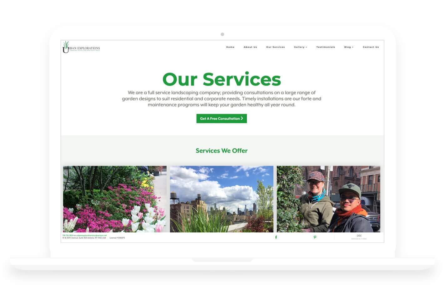
The process began with a content audit. It was important to know what content existed on the website currently, which content was no longer needed, and what content needed to be sourced/created. Luckily Patricia did a great job of documenting her recent projects over the years, and it made for a great start to showing off different types of interior and exterior landscape design the company has been working on. All of my converdsations with her helped me to understand the current and future needs of the site. The previous site had a small section for tips and gardening tricks that existed as small commentary in sidebars throughout the site, that often got overlooked. Pat really wanted to evolve this tips & tricks into a full blog with a select few content areas.
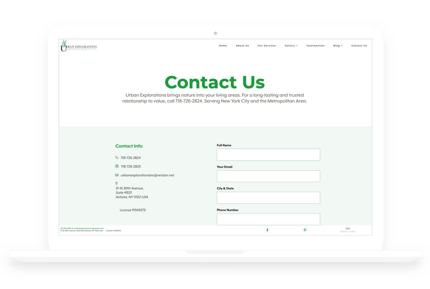
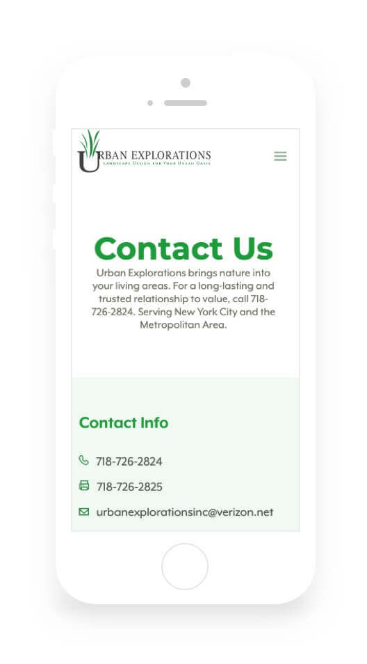
After gathering and organizing the content, the next step was figuring out a way to present the content in a simple, yet meaningful way. We explored a range of content wireframes in a quick user experience (UX) phase. This is where we tried to find out what the users of the site needed to accomplish, and how to present that info back to them in a way that made the site as efficient to user goals as possible. Being a landscape design website, we decided that the primary goals would be to browse prior work, and then to get in touch to schedule a design estimate, so we focused the pages and navigation around that.
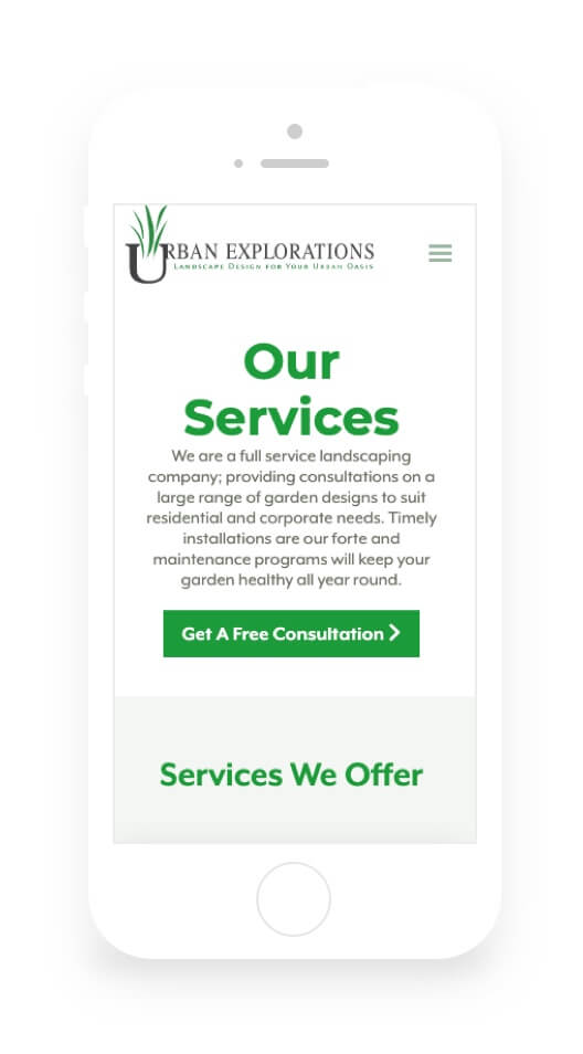
After a few rounds of wireframing the content, we moved into the visual design phase. This is where I pulled apart the existing brand design, expand it, and apply the basic concepts into a new mobile first website design. I presented three different visual directions for the site to take. The first direction was the direction you would most expect, which has a simple, modern and minimalist feel with heavy emphasis on photography. The second was a split screen animated transition site.The third option was visually focused on soft illustrations that intertwined the page layouts with parallax effects and made interesting use of space and made room for bold photography.
After the design stage was finished I moved into the development phase. I knew at this point that the project should be based in wordpress because of the team's familiarity and because we wouldn't have to transfer content to a new CMS. I also opted for a site structure that is based on CSS Grid and Flexbox. It provided an awesomely quick way to build the front-end of the site, and transition into the Wordpress theme contruction in PHP.
Wordpress has a huge amount of flexiblity, and the number of plugins available made it quite easy to build a set of highly customizeable, and simple to update content pages. You can see the site now at urbanexplorationsinc.com