The Pizza Wagon Logo & Branding
A retro-inspired food truck identity design
- Logo / Branding
-
Web Design
-
Vehicle Graphics
-
Poster/Flyer Design
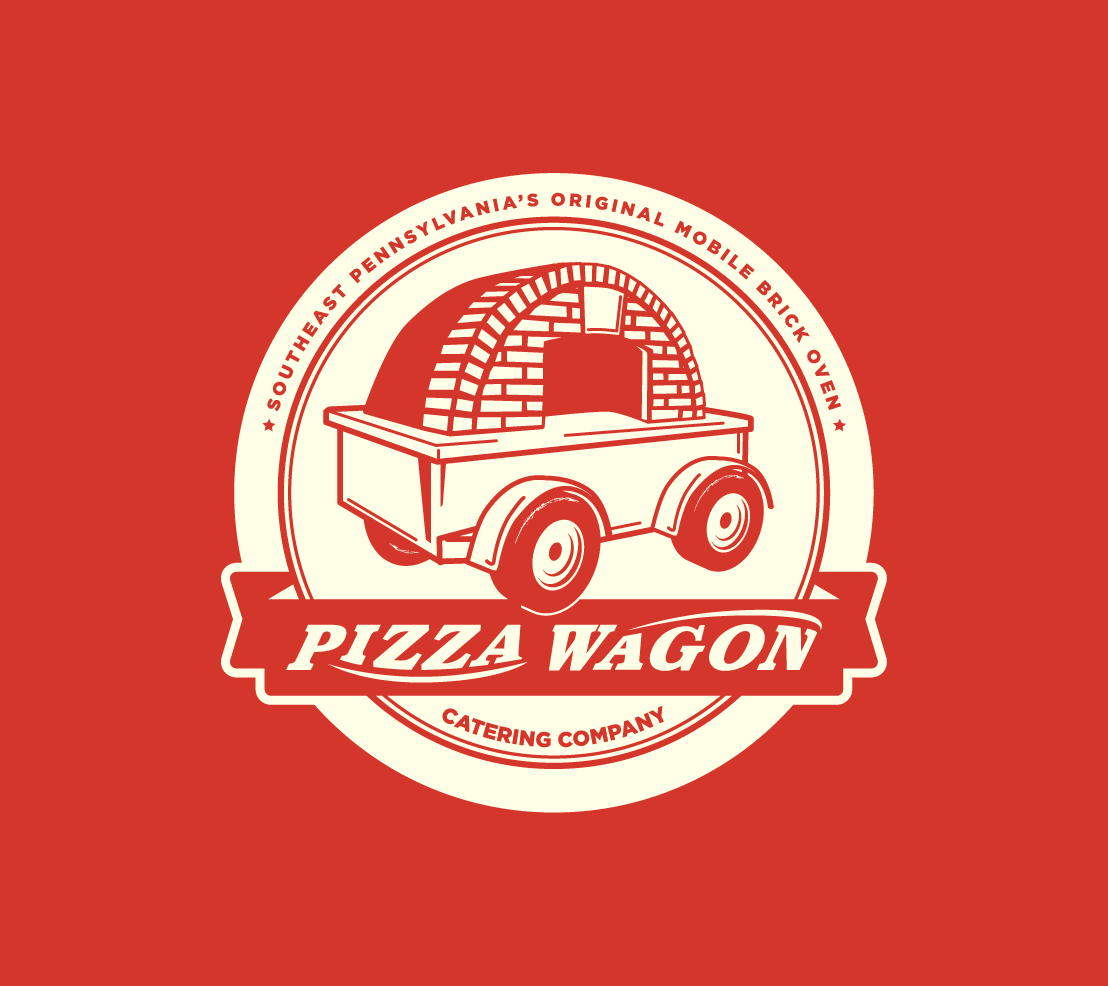
A fun brand identity for a food truck and catering service concept from former chef at ‘The Fountain Restaurant’ in Philadelphia, Josh Goldstein.
The name of the truck was inspired by the classic Radio Flyer Wagon and it's matching iconic red color. The tow-behind truck/trailer would house an authentic Italian Valoriani wood fired pizza oven, capable of reaching an internal temperature of 900º. The truck also has a refrigerated ingredient prep table and everything else you’d need to run a mobile pizzeria. The truck's home base would be Lansdale, Pa.
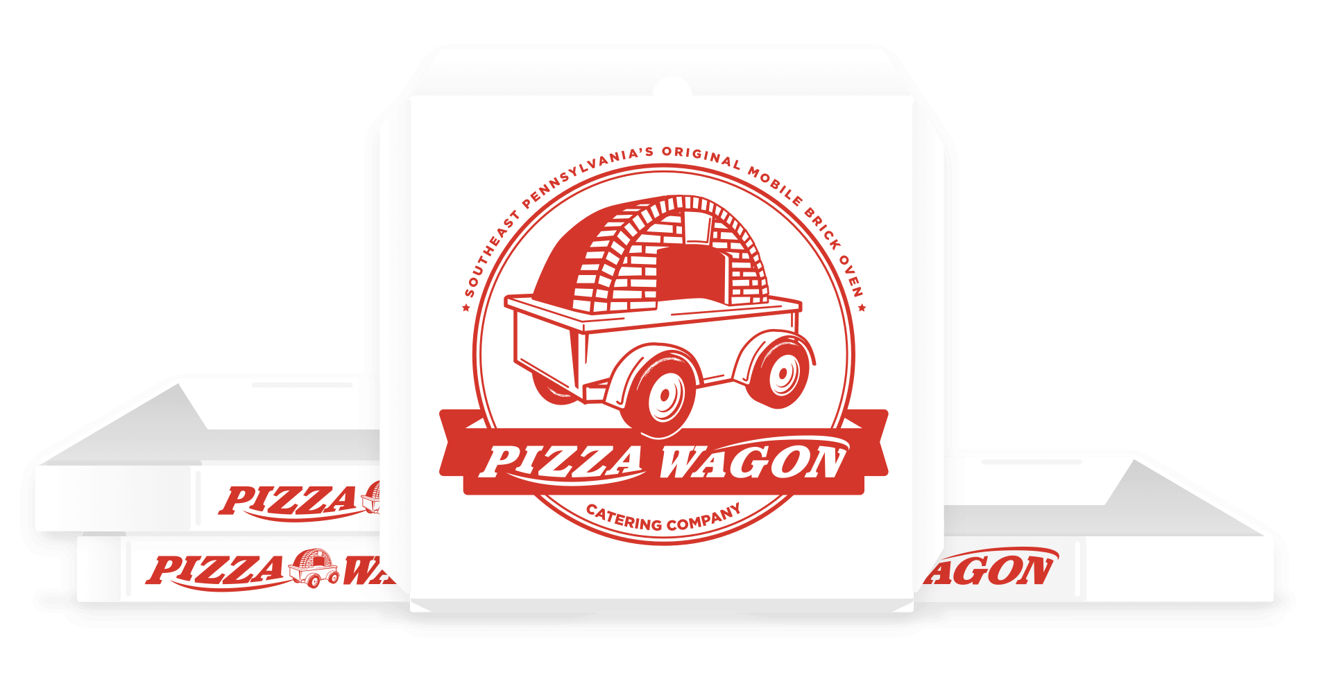
The new identity we were going to create needed to feel modern and professional like a great neighborhood restaurant, and also be fun and approachable with a throwback, nostalgia flair to match the Radio Flyer naming origin. With Josh’s restaurant experience the application requirements for the logo were well defined from the start. We needed to accommodate traditional and digital mediums like shirts/uniforms, menus, truck graphics and a potential website. Secondary applications for the brand spanned business cards, buttons, pins, stickers, flyers, email newsletters.
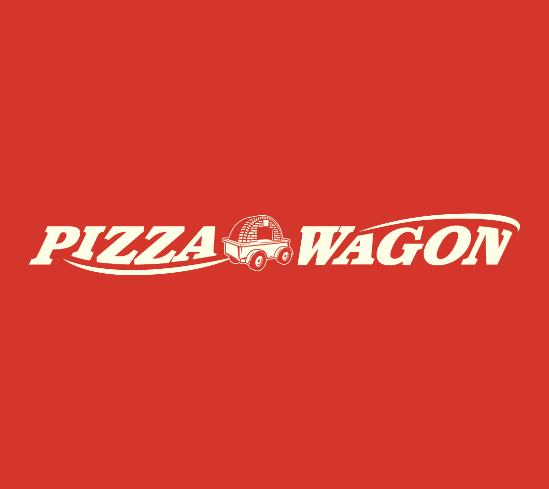
Early versions of the logo explored some subtle nods, and not so subtle (almost brinking on parody) homages toward Radio Flyer with use of banners and customized typography. Some options went the way of traditional pizzerias that use some likeness to pizza in the logo imagery. Even subtler options looked at minimal illustrations that blended wagon wheels and pizza slices. Some secondary icons and miscellaneous graphics also came out of this stage that eventually helped to visually expand the brand image. The final imagery we moved forward with was an illustration I created that mimicked the style of the Radio Flyer wagon, but featured a caricature of the truck with it’s wood fired oven featured prominently.
The final logo emerged as a one color mark for ease of reproduction in print, web and patches/embroidery for uniforms with an easily swappable set of colors for different uses. After a few years, The Pizza Wagon was doing well and had expanded and new things were on the horizon for them. But with growth/expansion additional needs for the brand were required. I worked with Josh and his team to update the Pizza Wagon logo to push the brand a bit further, and round out some of the concepts in the mark. We also moved from an open icon and banner, to a fully enclosed mark/badge.