Axiom Financial Tech Interface
Dashboard UI for Axiom Platform
-
For: A.I. Labs
-
UI Design
-
Invision Prototyping
-
User Experience
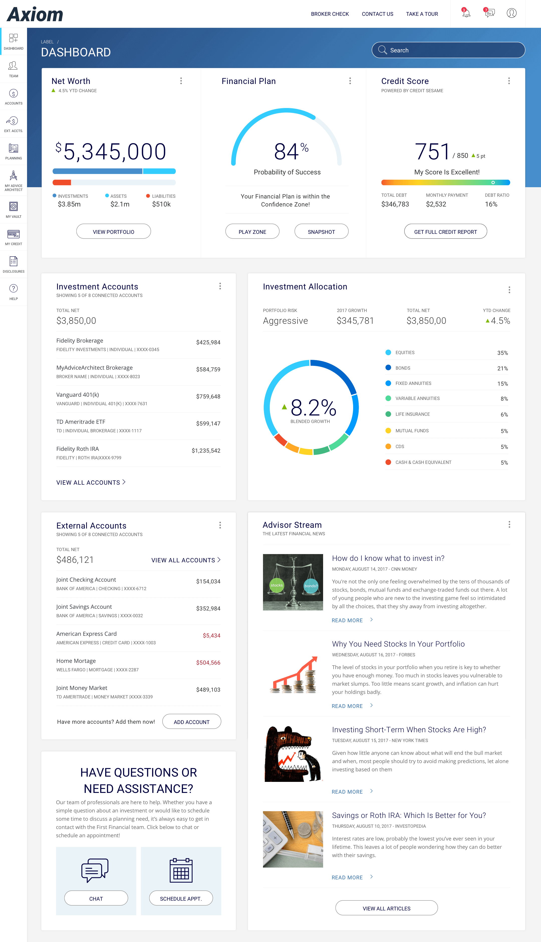
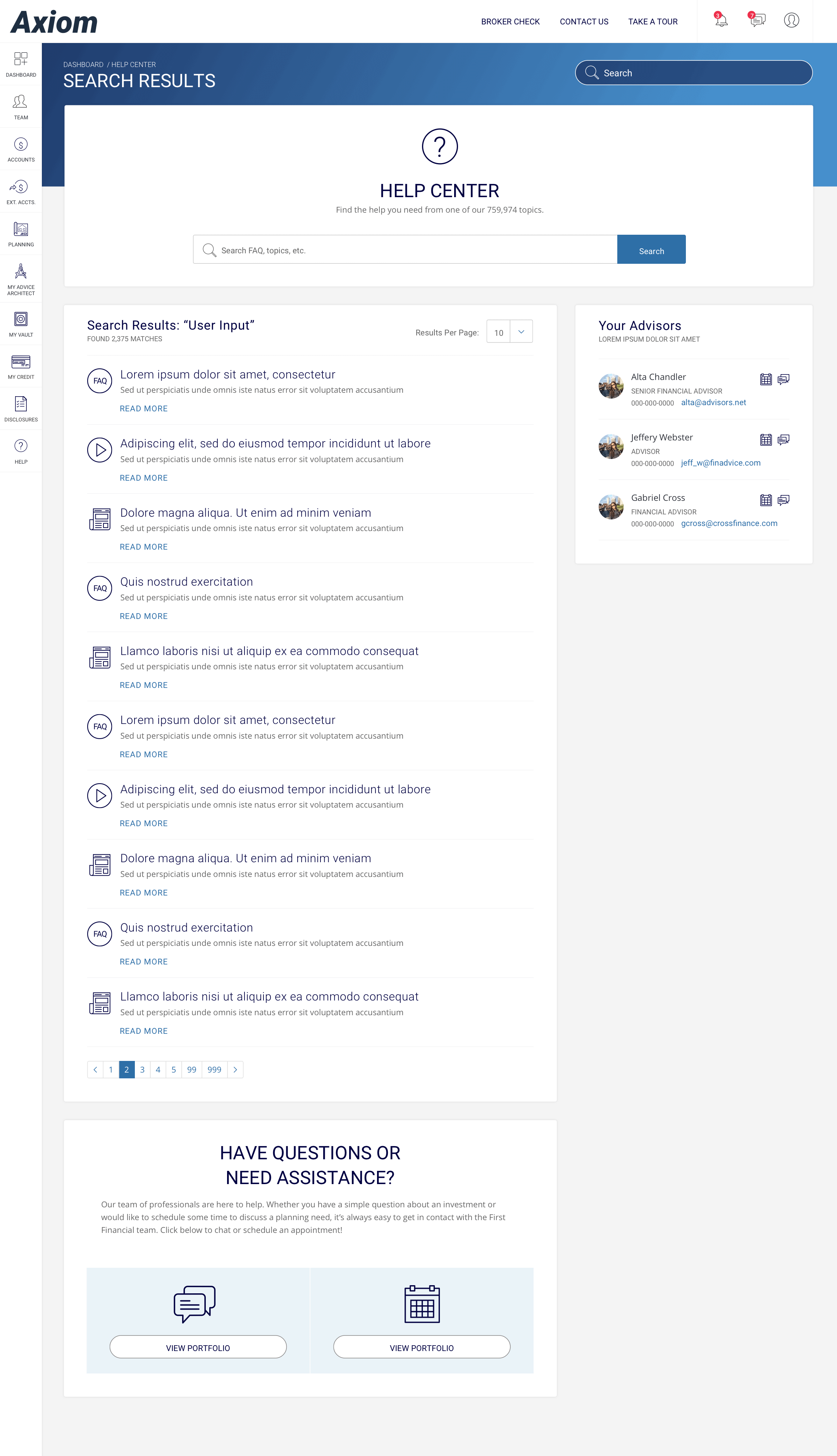
Axiom is the flagship platform of Financial Tech startup, A.I. Labs. They hired me to refresh the user interface and solve small UX issues along the way.
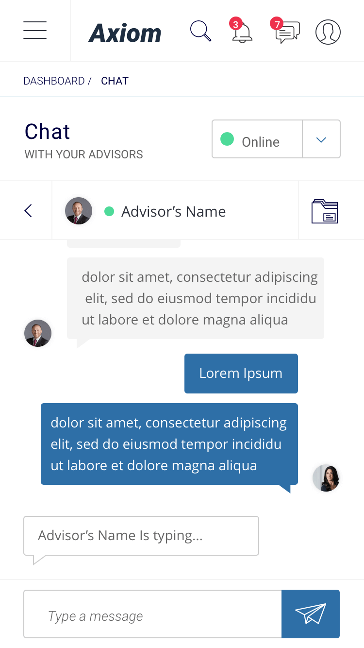
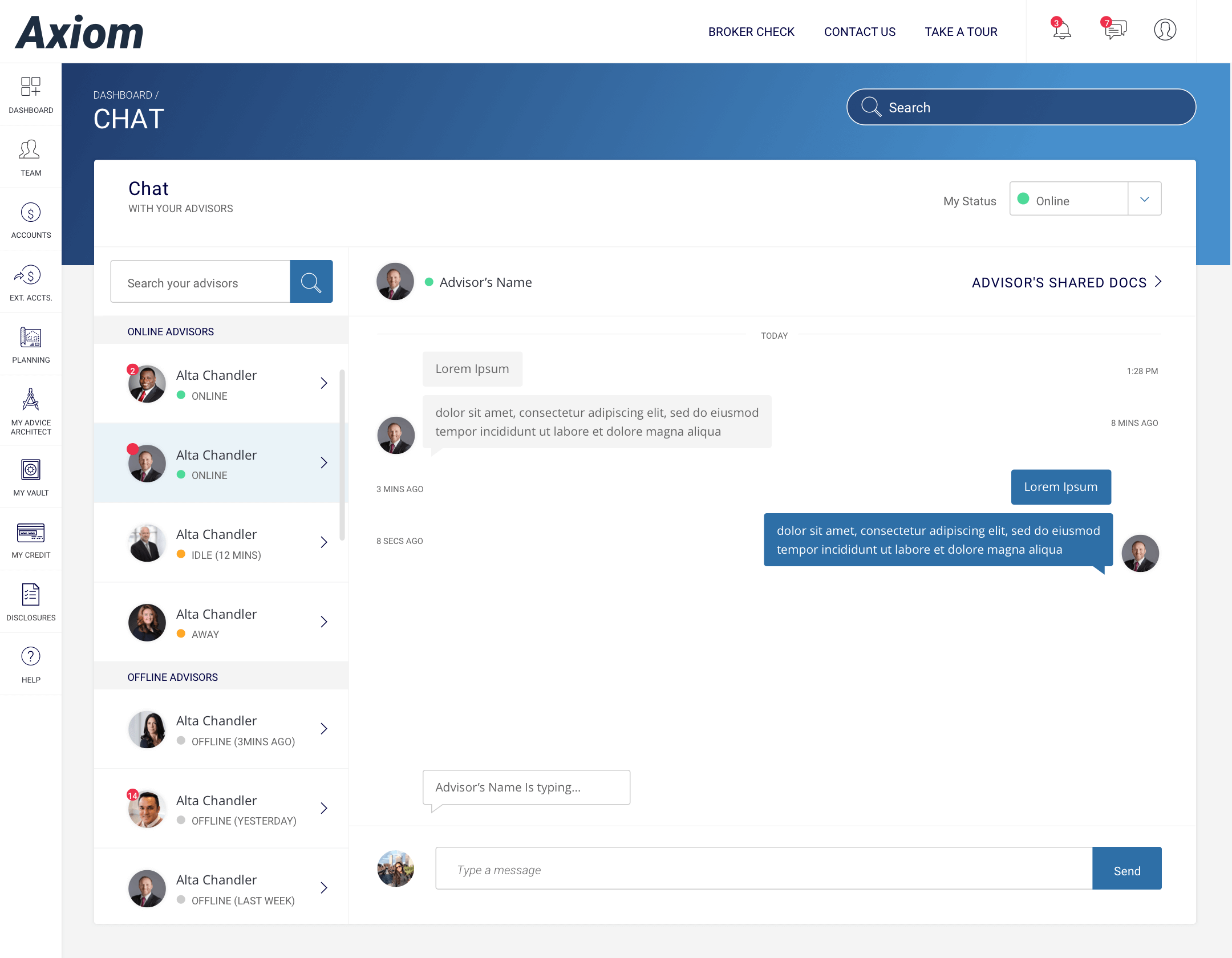
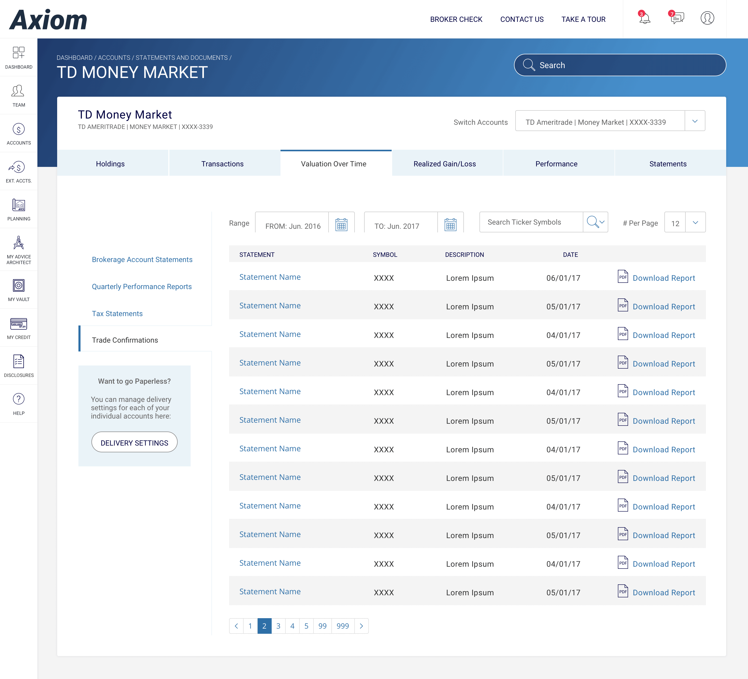
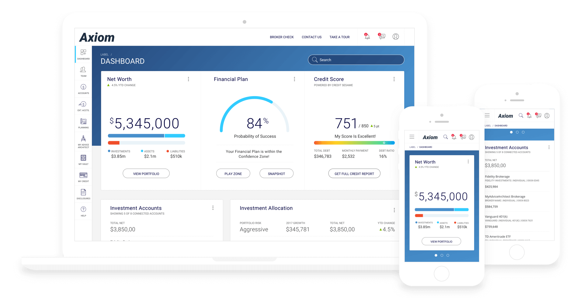
AI Labs wanted to provide easier access to your financial data. We planned to condense all your favorite financial applications into one unified system. This new system would also include an easy way to share your financial plans with your advisor. AI Labs also wanted the user to be able to test scenarios and forecast future gains/losses real life milestones.
We kicked off the project with building a style guide/component library. The interface required strict accessibility WCAG 2.0 level AA color contrast standards. There was already an existing UI/web brand guide in place from an older platform. AI Labs requested a static 1-to-1 refresh of the old guide to a new one in pdf format. I suggested we build maintain a component library instead. We ended up doing both.
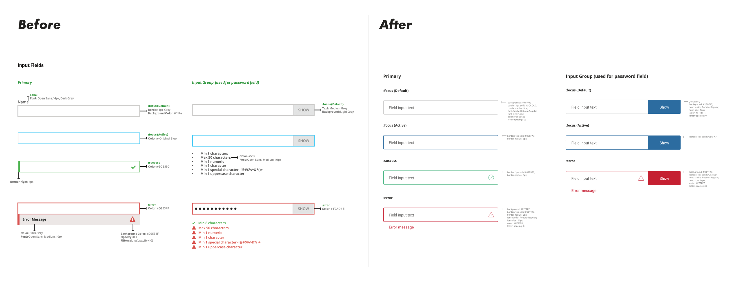
I put together the new style guide before beginning any layout/design work. This resulted periodic issues where elements did not work together seamlessly. This required me to update the library components every so often. Which ensured everything worked together better in real layouts. We expanded the old style guide from 18 pages to a more in depth 25 page UI style guide/component library. The component library grew more and more as we added new lockups of UI elements.
I handed off the static UI guide to the dev team to begin the HTML/CSS component library construction. When new components and interface patterns were required, I tried to base them on existing patterns as much as possible. Within the design and development sprints, components had to be updated and adjusted on the go, then mirrored in the component library after the fact, to keep things moving swiftly.
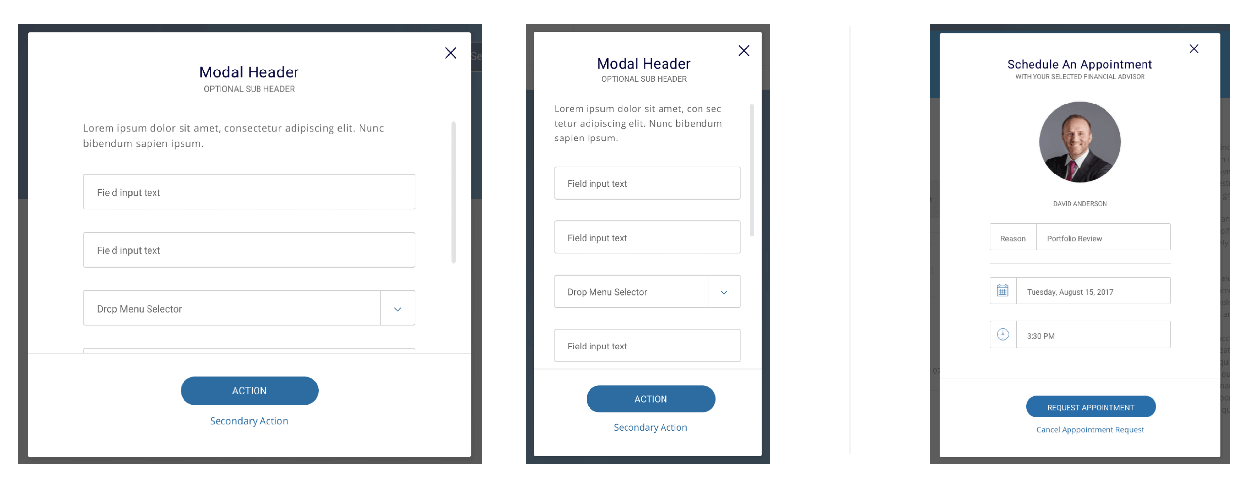
This project had a very loose UX process. The lead product designer and project manager built low-fidelity new feature user flows. They built those flows/wireframes in powerpoint, with a list of features and user goals. Then is was my turn to convert the flows/wireframes into a simple, and straight forward process for the user.
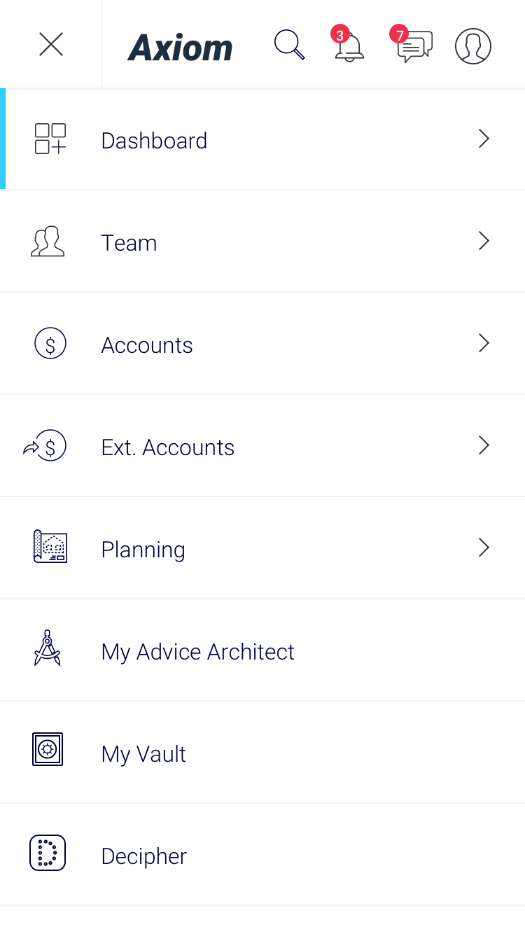
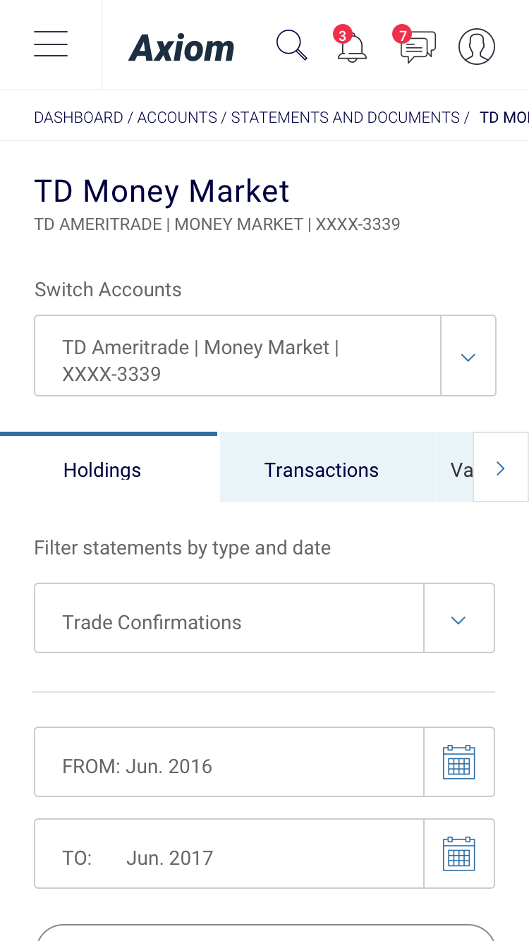
TWhen creating mockups we prioritized desktop devices as the primary use case. We did also create mobile UI mockups and prototypes, but that was a secondary experience. We expected our users to use the desktop app and to check in on mobile every so often. The developers and I, worked closely to resolve layout issues between desktop and mobile. This method kept design time low, and development on a rapid pace. The project manager, lead product designer, and I, worked to identify the next screens to build out. We chose screens to build out with the most new features or complex flows.
I designed all the screen layouts and component library in Sketch. I nested symbols and margins to simplify extensibility of components. Doing this also sped up the design of other new screens/flows. To create the prototype I used Sketch's Craft plugin to link to Invision. Working prototypes were built for desktop and mobile versions of the web app.
To see a few rounds of design changes that lead to the final interface you see here, check out this User Interface Evolution PDF
To protect company intellectual property, very specific screens are shown so as to not compromise any company or client data. For this reason, I cannot link to the invision, or working html prototype.